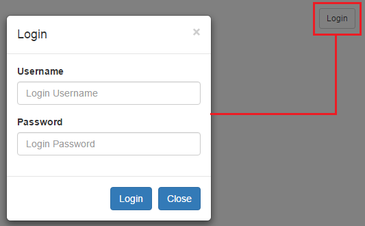
In this we will discuss the Bootstrap modal plugin.
Bootstrap tutorial for beginners
Creating a modal with bootstrap is very easy. The following example demonstrates, creating a modal with a header, body and footer.

Attributes and classes to customize the behaviour of the modal
Bootstrap tutorial for beginners
Creating a modal with bootstrap is very easy. The following example demonstrates, creating a modal with a header, body and footer.

<div class="modal fade" tabindex="-1" id="loginModal"
data-keyboard="false" data-backdrop="static">
<div class="modal-dialog modal-sm">
<div class="modal-content">
<div class="modal-header">
<button type="button" class="close" data-dismiss="modal">
×
</button>
<h4 class="modal-title">Login</h4>
</div>
<div class="modal-body">
<form>
<div class="form-group">
<label for="inputUserName">Username</label>
<input class="form-control" placeholder="Login Username"
type="text" id="inputUserName" />
</div>
<div class="form-group">
<label for="inputPassword">Password</label>
<input class="form-control" placeholder="Login Password"
type="password" id="inputPassword" />
</div>
</form>
</div>
<div class="modal-footer">
<button type="submit" class="btn btn-primary">Login</button>
<button type="button" class="btn btn-primary"
data-dismiss="modal">Close</button>
</div>
</div>
</div>
</div>
Attributes and classes to customize the behaviour of the modal
| Attributes / Class | Description |
|---|---|
| data-keyboard="false" | Prevents modal closing on escape |
| data-backdrop="static" | Prevents modal closing when clicked outside the modal |
| fade class | Animates modal |
| modal-sm class | Creates a small modal. Add this class on the div element that has the modal-dialog class |
| modal-lg class | Creates a large modal. Add this class on the div element that has the modal-dialog class |


.png)