Bootstrap list groups are useful for displaying simple lists of elements, as well as complex ones with custom content.
Bootstrap tutorial for beginners
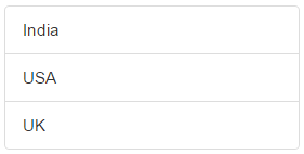
Basic list group : To create a basic list group, create an unordered list. Use .list-group class on the <ul> element and list-group-item class on the <li> element.
Output :
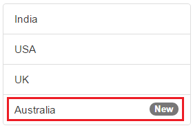
List group item with a badge : To create a badge, include a <span> element with .badge class inside the <li> element.
Output : Notice the new country "Australia" is displayed with the badge "New"
List group with hyperlinks : To create list group with hyperlinks, use <div> instead of <ul> and <a> instead of <li>
Output : On hover the cursor changes to a hand symbol and the background colour changes to grey. When you click on an item, you will be redirected to the respective URL.

Styling list items : Use contextual classes to style the list items. The following are the contextual classes

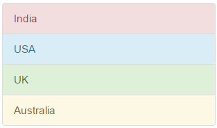
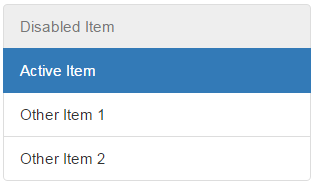
Highlight and disable list group items : Use .active class to highlight a list-group-item and .disabled class to disable a list item.
Output :
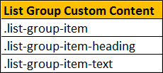
List group custom content : List groups can contain your own custom content. Nearly any HTML can be used. We will use the following 3 classes to create list group with custom
content.

Bootstrap tutorial for beginners
Basic list group : To create a basic list group, create an unordered list. Use .list-group class on the <ul> element and list-group-item class on the <li> element.
<ul class="list-group">
<li class="list-group-item">India</li>
<li class="list-group-item">USA</li>
<li class="list-group-item">UK</li>
</ul>
Output :
List group item with a badge : To create a badge, include a <span> element with .badge class inside the <li> element.
<ul class="list-group">
<li class="list-group-item">India</li>
<li class="list-group-item">USA</li>
<li class="list-group-item">UK</li>
<li class="list-group-item">
Australia
<span class="badge">New</span>
</li>
</ul>
Output : Notice the new country "Australia" is displayed with the badge "New"
List group with hyperlinks : To create list group with hyperlinks, use <div> instead of <ul> and <a> instead of <li>
<div class="list-group">
<a href="http://dell.com" class="list-group-item">Dell</a>
<a href="http://google.com" class="list-group-item">Google</a>
<a href="http://microsoft.com" class="list-group-item">Microsoft</a>
</div>
Output : On hover the cursor changes to a hand symbol and the background colour changes to grey. When you click on an item, you will be redirected to the respective URL.
Styling list items : Use contextual classes to style the list items. The following are the contextual classes
<ul class="list-group">
<li class="list-group-item list-group-item-danger">India</li>
<li class="list-group-item list-group-item-info">USA</li>
<li class="list-group-item list-group-item-success">UK</li>
<li class="list-group-item list-group-item-warning">Australia</li>
</ul>
Highlight and disable list group items : Use .active class to highlight a list-group-item and .disabled class to disable a list item.
<ul class="list-group">
<li class="list-group-item disabled">Disabled Item</li>
<li class="list-group-item active">Active Item</li>
<li class="list-group-item">Other Item 1</li>
<li class="list-group-item">Other Item 2</li>
</ul>
Output :
List group custom content : List groups can contain your own custom content. Nearly any HTML can be used. We will use the following 3 classes to create list group with custom
content.
<div class="list-group">
<a href="#" class="list-group-item">
<h4 class="list-group-item-heading">List Group Item 1 Heading</h4>
<p class="list-group-item-text">List Group Item 1 Text</p>
</a>
<a href="#" class="list-group-item">
<h4 class="list-group-item-heading">List Group Item 2 Heading</h4>
<p class="list-group-item-text">List Group Item 2 Text</p>
</a>
<a href="#" class="list-group-item">
<h4 class="list-group-item-heading">List Group Item 3 Heading</h4>
<p class="list-group-item-text">List Group Item 3 Text</p>
</a>
</div>


.png)