In this we will discuss the concept of
1. Offsetting the Grid Columns
2. Bootstrap classes to style an <img> element
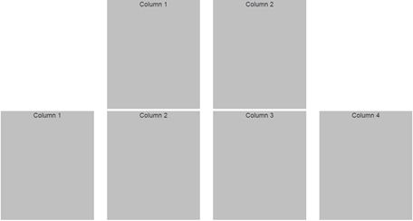
When creating website layouts using the grid system, you may want to move grid columns to the right for alignment purpose. Let us understand this with an example.
Let us say we want to create a layout as shown below.

This can be very easily achieved with the following HTML
Now, let us say we want the 2 columns in the first row to be centered. To center the columns, we need to push the first column to the right by 3 columns.

This is exactly the purpose of bootstrap offset classes. Just like how we have different grid classes for different screen sizes, we have the corresponding offset classes as well.

The following HTML will center the 2 columns in the first row. This is achieved by using col-md-offset-3 which is going to push the first column in the first row by 3 columns.
Now, we want 6 columns gap between the first and second columns in the first row. In other words the layout should be as shown below.

So we want the second column in the first row to be pushed 6 columns to the right. This can be very easily achieved by using col-md-offset-6 class on the second column in the first row.
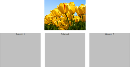
Let us now look at a simple example of where this grid column offset feature could be useful. Let us say we want to display 3 equal columns in the second row and only one image in the first row and the image should be centered.

This can be very easily achieved with the following HTML.
If you view the page in the browser at this point, you will see 2 problems
1. The width of the image is slightly larger than the columns in the second row.
2. As you resize the browser, and when the screen size is of a small device or extra small device, the image is not responsive.
Let us see how to solve these problems one by one.
1. To make the width of the image same as the width of the columns in the second row, remove margin style from CustomStyles.css and include margin-bottom style. With this change .customDiv class will be as shown below
2. To make the image responsive, add img-responsive class on the img element
The following bootstrap classes are useful to style an img element
.img-circle
.img-thumbnail
.img-rounded
Please note : For some reason img-rounded class is not working as expected when used along with any of the grid or offset classes. Without these classes we get the rounded corners as expected. If you know the fix for this issue, please leave it as a comment so it could help us.
1. Offsetting the Grid Columns
2. Bootstrap classes to style an <img> element
When creating website layouts using the grid system, you may want to move grid columns to the right for alignment purpose. Let us understand this with an example.
Let us say we want to create a layout as shown below.

This can be very easily achieved with the following HTML
<div class="container">
<div class="row">
<div class="col-md-3">
<div class="customDiv">Column 1</div>
</div>
<div class="col-md-3">
<div class="customDiv">Column 2</div>
</div>
</div>
<div class="row">
<div class="col-md-3">
<div class="customDiv">Column 1</div>
</div>
<div class="col-md-3">
<div class="customDiv">Column 2</div>
</div>
<div class="col-md-3">
<div class="customDiv">Column 3</div>
</div>
<div class="col-md-3">
<div class="customDiv">Column 4</div>
</div>
</div>
</div>
Now, let us say we want the 2 columns in the first row to be centered. To center the columns, we need to push the first column to the right by 3 columns.

This is exactly the purpose of bootstrap offset classes. Just like how we have different grid classes for different screen sizes, we have the corresponding offset classes as well.

The following HTML will center the 2 columns in the first row. This is achieved by using col-md-offset-3 which is going to push the first column in the first row by 3 columns.
<div class="container">
<div class="row">
<div class="col-md-3 col-md-offset-3">
<div class="customDiv">Column 1</div>
</div>
<div class="col-md-3">
<div class="customDiv">Column 2</div>
</div>
</div>
<div class="row">
<div class="col-md-3">
<div class="customDiv">Column 1</div>
</div>
<div class="col-md-3">
<div class="customDiv">Column 2</div>
</div>
<div class="col-md-3">
<div class="customDiv">Column 3</div>
</div>
<div class="col-md-3">
<div class="customDiv">Column 4</div>
</div>
</div>
</div>
Now, we want 6 columns gap between the first and second columns in the first row. In other words the layout should be as shown below.

So we want the second column in the first row to be pushed 6 columns to the right. This can be very easily achieved by using col-md-offset-6 class on the second column in the first row.
<div class="container">
<div class="row">
<div class="col-md-3">
<div class="customDiv">Column 1</div>
</div>
<div class="col-md-3 col-md-offset-6">
<div class="customDiv">Column 2</div>
</div>
</div>
<div class="row">
<div class="col-md-3">
<div class="customDiv">Column 1</div>
</div>
<div class="col-md-3">
<div class="customDiv">Column 2</div>
</div>
<div class="col-md-3">
<div class="customDiv">Column 3</div>
</div>
<div class="col-md-3">
<div class="customDiv">Column 4</div>
</div>
</div>
</div>
Let us now look at a simple example of where this grid column offset feature could be useful. Let us say we want to display 3 equal columns in the second row and only one image in the first row and the image should be centered.

This can be very easily achieved with the following HTML.
<div class="container">
<div class="row">
<img src="Images/Tulips.jpg" class="col-md-4 col-md-offset-4" />
</div>
<br />
<div class="row">
<div class="col-md-4">
<div class="customDiv">Column 1</div>
</div>
<div class="col-md-4">
<div class="customDiv">Column 2</div>
</div>
<div class="col-md-4">
<div class="customDiv">Column 3</div>
</div>
</div>
</div>
If you view the page in the browser at this point, you will see 2 problems
1. The width of the image is slightly larger than the columns in the second row.
2. As you resize the browser, and when the screen size is of a small device or extra small device, the image is not responsive.
Let us see how to solve these problems one by one.
1. To make the width of the image same as the width of the columns in the second row, remove margin style from CustomStyles.css and include margin-bottom style. With this change .customDiv class will be as shown below
.customDiv{
margin-bottom:3px;
min-height:300px;
background-color:silver;
text-align:center;
font-size:large;
}
2. To make the image responsive, add img-responsive class on the img element
<img src="Images/Tulips.jpg" class="col-md-4 col-md-offset-4 img-responsive" />
The following bootstrap classes are useful to style an img element
.img-circle
.img-thumbnail
.img-rounded
Please note : For some reason img-rounded class is not working as expected when used along with any of the grid or offset classes. Without these classes we get the rounded corners as expected. If you know the fix for this issue, please leave it as a comment so it could help us.


.png)